

OnSIP InstaPhone
Project Description:
While working at OnSIP (also known as Junction Networks) as their in-house UX Designer, I re-designed one of their main product offerings, InstaPhone - an internet based soft phone. Meant to act as a business phone and communication dashboard for customers that didn’t have desktop phones or who were working away from their office desk, InstaPhone allowed users to message their coworkers, make and receive audio and video calls from both inside and outside of their company networks, easily see basic details about those they were talking to, and create unique links to send out to whoever they’d want to have a call with (rather than using a phone number). For an additional cost, managers had their own dashboard that allowed them to keep track of calls coming into a calling queue, and how their team was responding to those calls.
As the designer in charge of this project, I completely redesigned the the previous interface. I also designed user flows, mock ups, low fidelity and high fidelity screens for the many additional features we added.
Client:
Junction Networks / OnSIP
Role:
UX/UI Designer
Tools:
Adobe CS, Sketch, Intercom.io, Atomic.io, Agile

Video Calling
When designing InstaPhone’s video call view, I wanted to get the video to be as large as possible without going into full-screen mode, so that the user can have the freedom of multi-tasking with their screens if they needed to. The user still has the same options as they do with a voice call (transfer calls, mute, etc.). With a simple scroll, they have the information they need about the business contact they are conversing with - even if they haven’t previously added them into their contact list.
SIDE PANEL
You can see on the left the main navigation, the user’s personal navigation where they can switch between accounts, and their contact list. Above the contact list, you can see the current active call. Should the user have multiple active calls, they will all be listed here, and the user can switch between them as they need to.

Contacts
A user can add contacts during the onboarding process, or they can add them later on as the need arises. They can also chose to add everyone from their company with a registered instaphone account, select groups to add at once, or add individuals. Once they’re on the contact list, it’s easy to click the name of the person they are interested in calling. From there, you can see their profile photo (if they’ve added one), or else their default icon, and other information such as their internal extension. They can also simply click a button to begin a call.

Voice calling
Once a user has started a voice call, or answered an incoming voice call, they will continue to see the user’s relevant information. Upon interviewing our users I learned that they had very much liked a feature from an old version of the prouct called ‘drag-and-drop transfer’, so I added that back into the tool panel in an updated way.

Queue Status
Available to our paid users were features like Queue Status and Queue Reporting, which let managers supervise important information as it occurred. They could see, for each queue registered to their company account, how many calls were currently in the queue, which agents were on a call or were available, what the maximum wait time for callers was, etc. The challenge in designing this page was to create a design that could scale from minimal information to a large amount of incoming information, depending on the company account, yet make it easy to read in any situation.
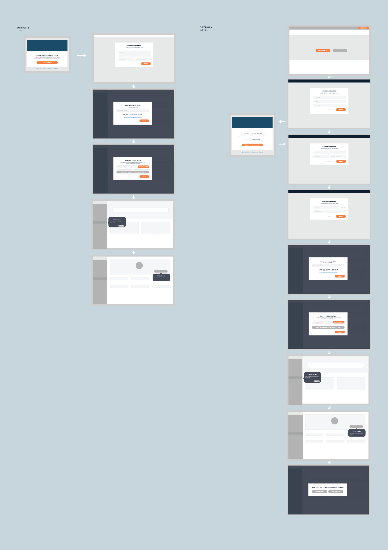
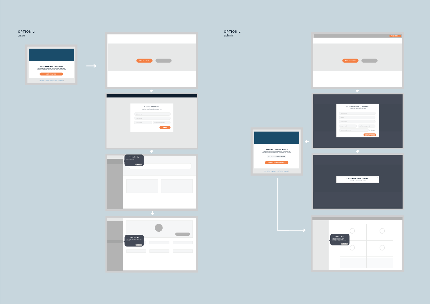
interviewing customers and process
This project began with a minimal viable product redesign, to which we added features on long-term through the process of two-week sprints. Because of the ever-present contact list, I decided to put the bulk of navigation on the side panel, which would then allow me to structure the bulk of the fluid information within the main body of the page. From here, we organized the features into what we believed our users absolutely would need, and then which ones were less valuable or outside of our abilities to achieve, and built out the product that way.
After the launch of our redesigned InstaPhone, we utilized intercom to speak to customers directly about features they would like to see, what they felt could be done better. We found that customers would use the easy contact with an employee to ask questions, and while that was insightful because I as the UX Designer could see where customers were running into friction, it also informed our decision to push for an easier way to contact our support department straight through from the platform.
While working at OnSIP, I took part in the product planning council, which met regularly to decide on the future direction of our product. I utilized the user research and feedback to help advocate for features I believed the users truly needed.

