

Chief Core Groups
Project Description:
Chief is a private network that connects women at the highest tiers of business, with the goal to get more women sitting at the metaphorical table. Chief members are placed into hand-curated ‘Core Groups’, which are groups of peers that meet monthly to work through career challenges and developments together.
I was brought on as a Senior Designer to help develop Chief’s member-facing site. Here, I’ll walk you through a feature that I designed for their member-facing website: Core Groups. The Core Group page aimed to inform members when their core group meetings were, and to let them view the other members of their group.
You can find Chief’s website here.
Client:
Chief
Role:
Freelance Senior UX Designer
Worked with:
Academy UX and Originate
tools used:
Sketch, Zeplin, Abstract

DEfining the brief
The Chief team had put together a comprehensive brief as to what they envisioned this feature to be and what needs it needed to fulfill, so my first step was to thoroughly go through the brief to understand it to the best of my ability. After reading through the brief multiple times, it became clear that this feature needed to meet users at two separate parts in their journeys:
At the first stage, where the user has signed up for Core Groups but has not yet been placed into their bespoke grouping.
At the second stage, after the user has been placed into a Core Group.
Users in these two stages had differing needs. At the first stage, they needed to be able to see where they were in the process. Users in this stage often got confused about why group formation took so long (it could take up to two weeks, as each hand member was hand-placed in a curated group after careful consideration) and the operations team frequently dealt with inbound questions from customers about this.


At the second stage, users needed a way to see logistical information regarding their upcoming meetings (date, time, location) so that they could easily check without emailing the staff, and plan ahead into their busy schedules. Users also needed an easy way to know who was in their Core group, which helped the women get to know their group better before their first meeting even began, but also gave the user a reference to look back at their group members’ names and faces to alleviate pressure.
However, as I carefully worked through the brief in these early stages, I found myself running into questions, opportunities, and possible pain-points that might be reached long-term that had not been addressed in the brief. By gathering these deeper questions, I was able to bring them back to the Chief Team and talk through the questions I had, discuss possible missed user needs, and determine a clear plan of what would be the MVP and what would come in future project phases.
With this clarity, I was able to create a user flow that the team agreed upon, and move forward with design iterations.
Mockups + Iterations
Once all information was gathered and a clear user flow was in place, I began iterating. Because this was just one feature I was designing and others were already underway, a few useful digital assets were already designed (ie. card system, a way to display member information, typography + iconography). Utilizing these design assets in my library allowed me to save time by jumping straight into low-fidelity mockups.
Because I worked in-house for much of this project, changes and iterations were made largely through quick conversation with the CPO, Head of Product and Lead Designer. Once high-fidelity designs were in a good place, a presentation was made to stakeholders and small tweaks were made until the final MVP was agreed upon.


Final mvp design: Where am I in the process?
One of the most important goals in this design was to give users a sense of where they were in the process of Core Group Formation during the weeks before they are officially placed within a group. To reduce confusion, the process was broken up into three simple steps.
When the user first enters the screen, they’re prompted to complete the form that informs the Chief staff more about what they are looking for and might benefit from in a Core Group. This form is also emailed to them. Once a questionnaire form is on file for that user, the button disappears.
After that step is completed, the user is placed into step 2, and the shadow box and progress bar are moved down to accommodate that upon page reload. This gives the user a sense of progress and provides further information to set expectations. However, the user will never actually see Step 3 highlighted, as once they are placed, they will receive an email announcing the news and a page reload will bring them to their My Core Page (as seen below).
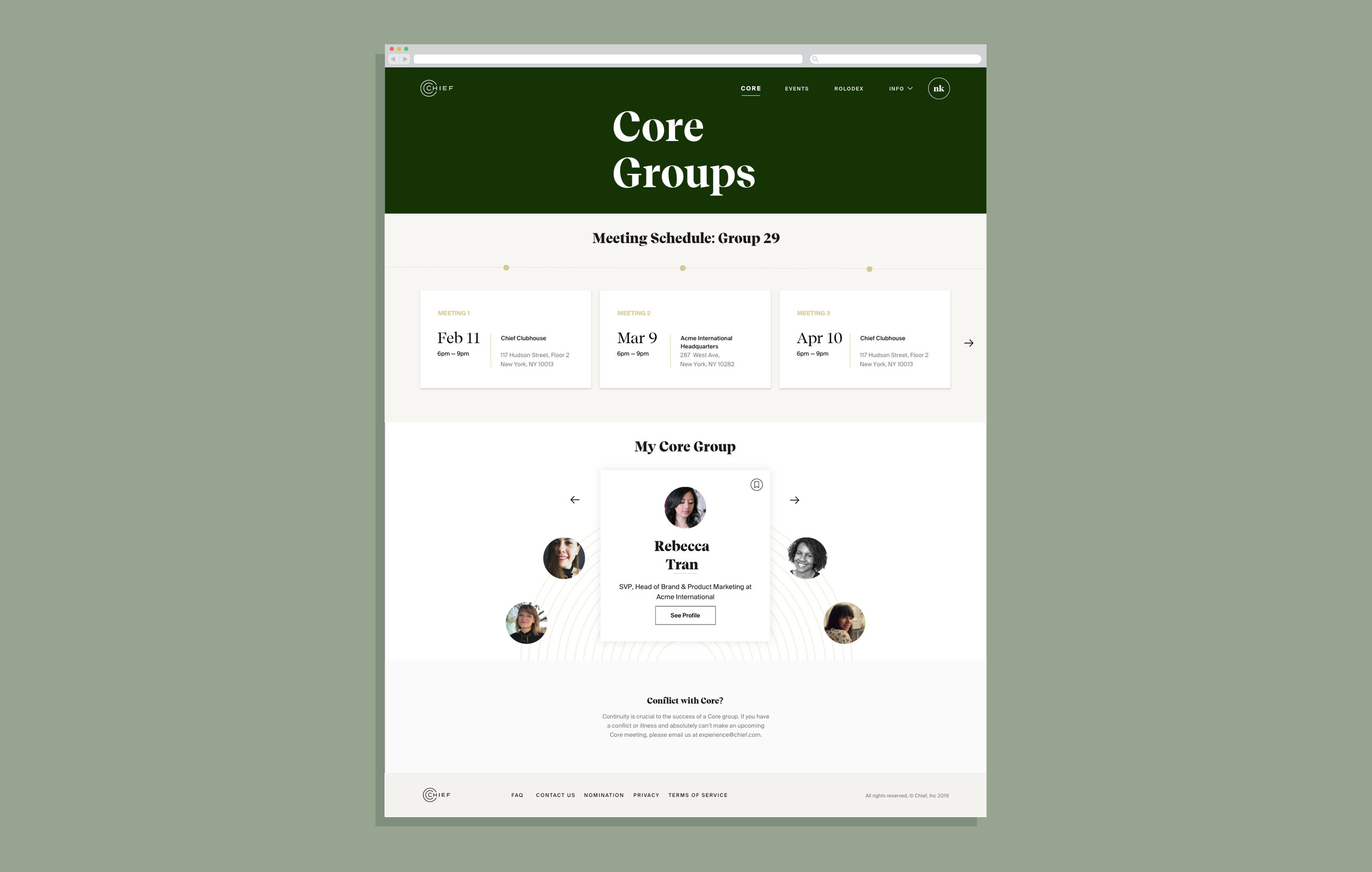
FInal MVP Design: Meeting Schedule
Users have Core Group meetings scheduled every 4-6 weeks, and the Chief team tries to schedule these many months in advance. This particular user group already has a very busy business and personal schedule, and so it was important that they could not only see their current upcoming meeting’s information at a glance, but all of their future meetings’ as well.
Because of the amount of information needed to be available, this schedule was tucked into a carousel. Only showing three at once reduces visual noise, and the carousel is automatically positioned with the user’s next upcoming meeting at the first spot, so that the user only needs to scroll through when they need to see far into the future. Meetings that aren’t scheduled yet have a different visual typography to clearly differentiate themselves from scheduled meetings.


Final MVP Design: My Core Group
As we went through the iterations of how best to display Core Group, the idea of these women sitting around a table together began to shape how we thought of this section. We wanted to get away from a more stagnant card design and make this section, where the user first gets to know their group members, something more dynamic and special.
In the final MVP, the user cycles left and right to view their fellow members, and since not all members are showing at once, it allows for the variable of there being between 8-12 members in any given group. In order to communicate the motion of the UI to the engineers, I created an animation and shared it with the engineers.
